BluPri Devlog #2 — The desig phase
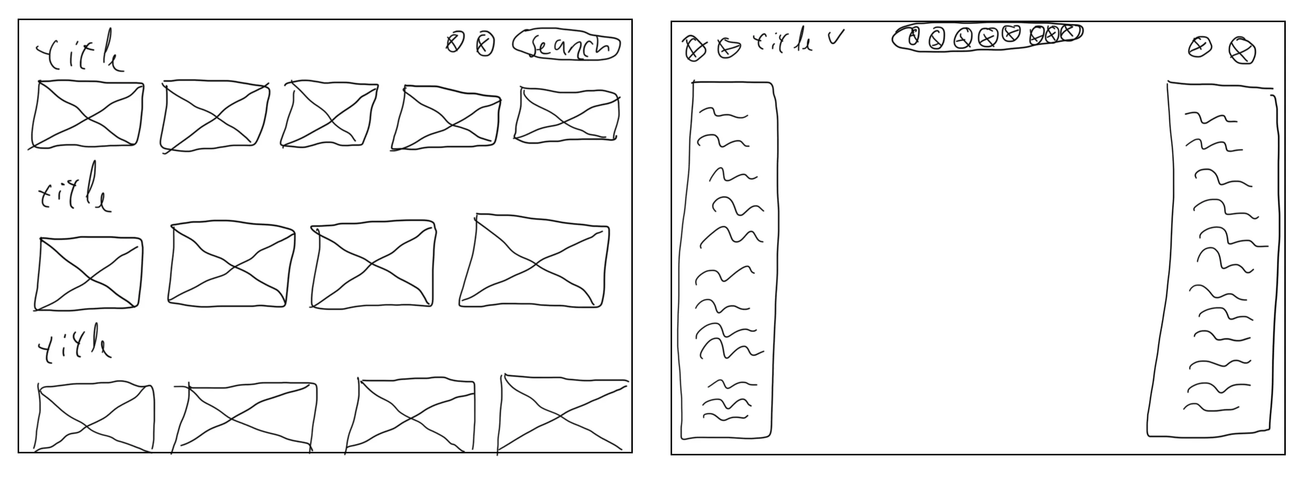
The last few weeks I tried to create a design for BluPri. Long story short, I created a few screens but not the complete design I had in mind. I think I have enough to start building though. I started by looking around at a few apps with a similar idea, then did some quick sketches to get a rough idea of what I wanted.
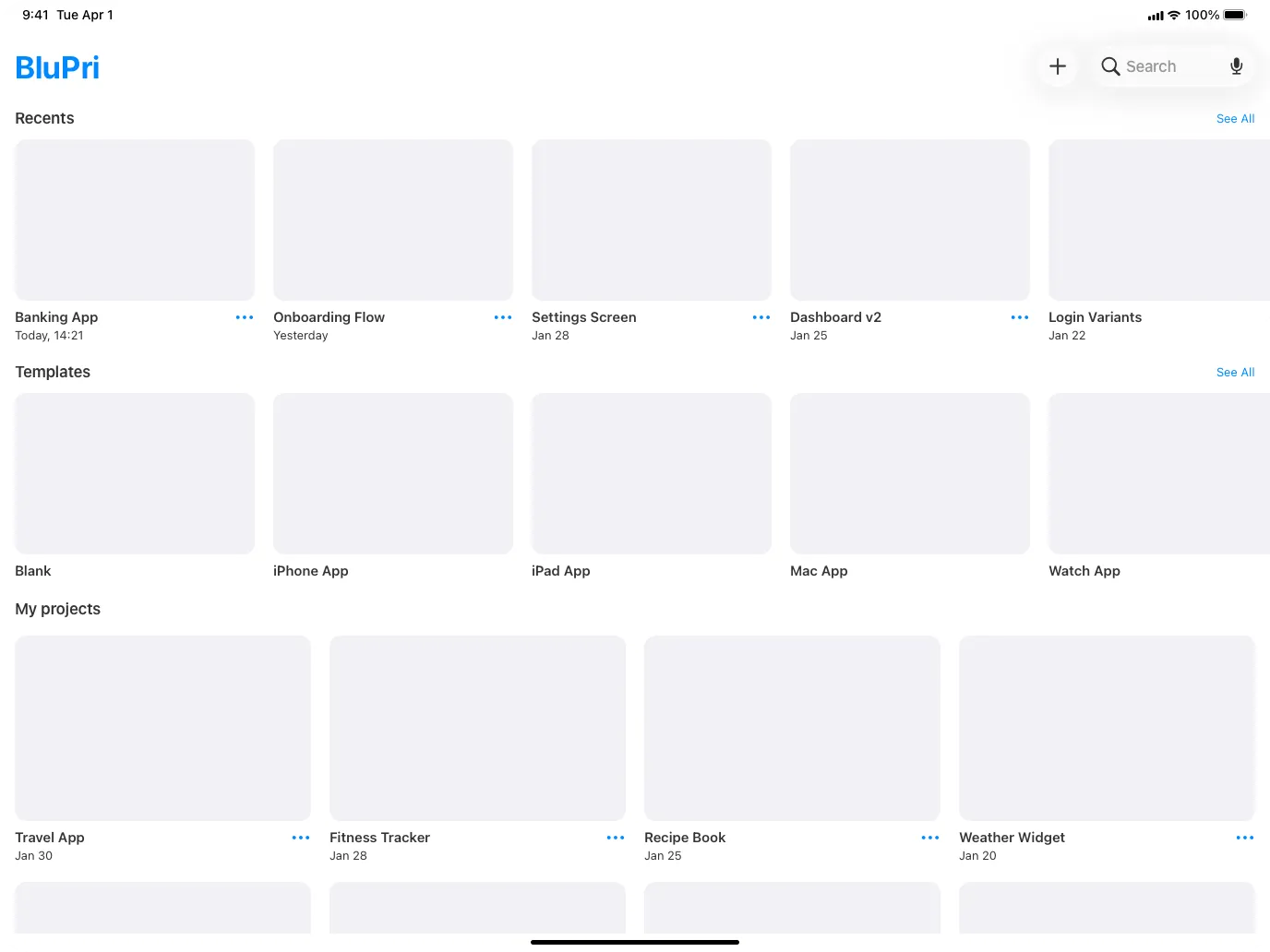
After the sketches I browsed Dribbble for more inspiration and started designing in Sketch. The first screen I designed was the home screen. On the home screen the user can see three categories: recents, templates and my projects. With these groups the user can easily create a new project or continue an existing one. If the user has a lot of projects they can search with the search bar. Each card will show a preview of the project with a title and the last modification date.
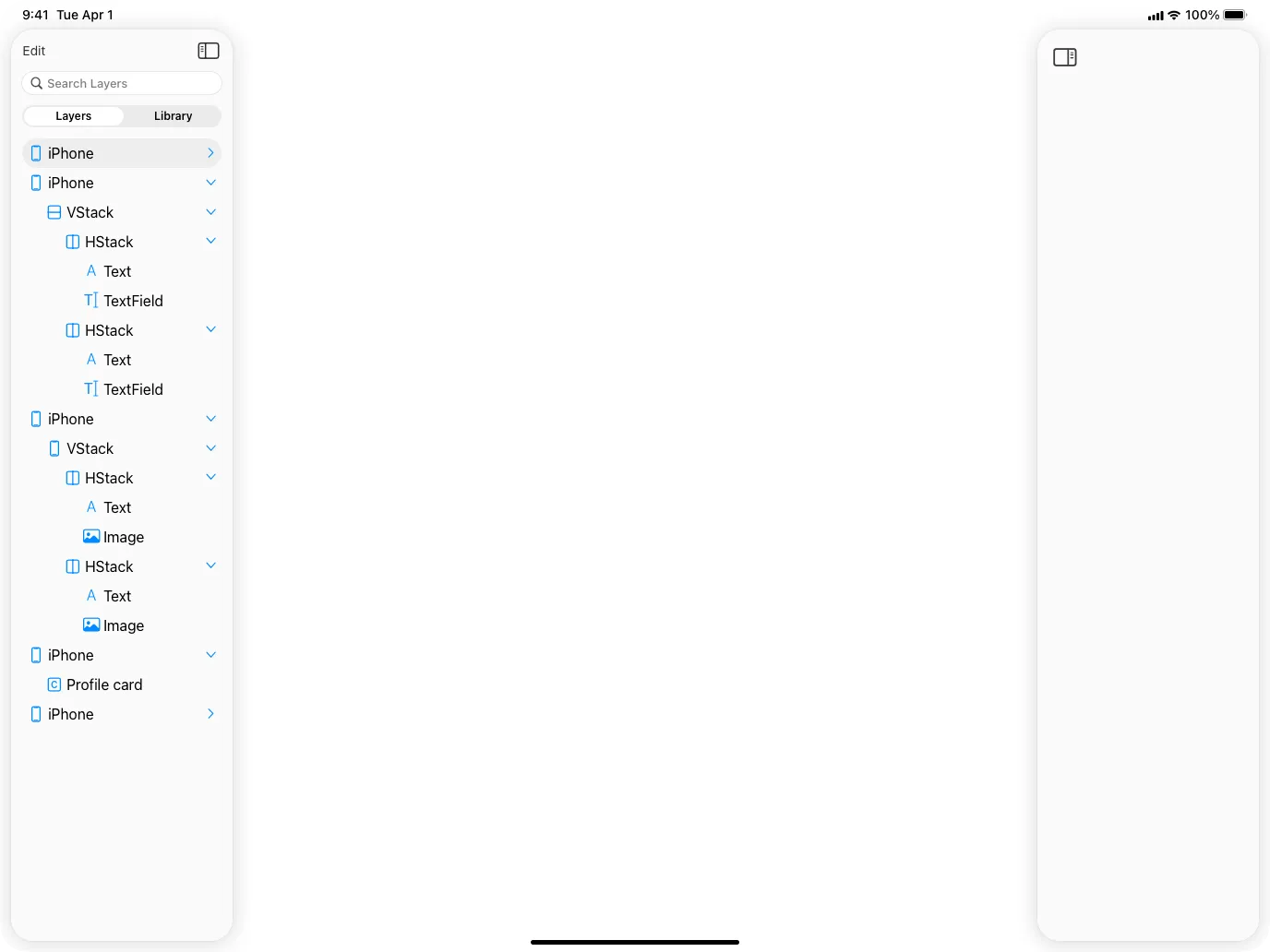
If a user starts a new project or clicks on an existing project they get to the editor screen. On the editor screen there is a left sidebar and a right sidebar. In the middle the user can drag and drop screens or components onto the canvas. In the left sidebar the user can see the layers and screens. In the library tab the user can create or select custom components, and it’s also possible to search for a layer or component. In the right sidebar the user can edit the width and height of a component or its properties like color, font size, font type, etc. On top there is a toolbar for quick actions like zoom, undo and redo.
Since I’m a little stuck on the design phase I’m just going to start building. I expect that when I start building, things will look different than I imagined or a better user experience will present itself.